In a world where algorithms can now write, design, and decide, brands are being forced to ask big questions:
What does your brand look like in the age of AI, and more importantly, what does it stand for?
As a marketing agency working closely with IT businesses, we’ve seen first-hand how companies are responding. Some are leaning into AI-powered minimalism, driven by efficiency and tech-optimised precision. Others are rebelling, embracing bold, chaotic, or nostalgic aesthetics to signal the human behind the brand.
And design trends are the battleground where this tension plays out.
Design Trends – A Timeline of Shifting Identity
Understanding today’s design climate means looking at where we’ve come from. Each era of design reflects not just aesthetic preferences, but broader cultural and technological shifts, especially in B2B tech.
2005–2012: Skeuomorphism
Design mimicked the real world, think leather notebooks, glass buttons, and shadowed folders. It was familiar, tactile, and comfortingly human.
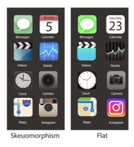
2013–2018: Flat Design
Apple and Microsoft stripped everything back. Minimalism took centre stage. Clean lines, bold colours, and a less-is-more philosophy emerged as digital-first brands aimed for simplicity and speed.
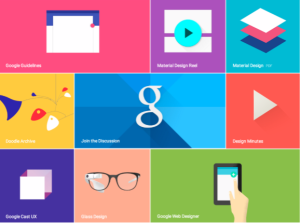
2018–2021: Material Design
Flat design evolved. Google introduced ‘Material’, bringing depth, subtle gradients, and a more dynamic interface to visual storytelling.
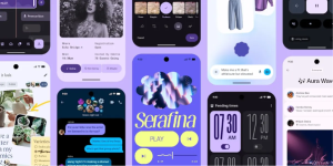
2022–Present: Maximalism & Digital Brutalism
Design trends exploded. Welcome to ‘chaos with a purpose’, asymmetry, clashing colours, raw fonts, and unapologetically weird layouts. It’s been described as Gen Z’s rebellion and a visual reminder that not everything should be generated by AI.
AI vs. Aesthetic: A New Creative Tension
Much of today’s maximalist and brutalist design is seen as a reaction to AI-generated sameness. Tools like Midjourney, Canva, and Adobe Firefly churn out hyper-polished visuals, modular, clean, optimised… and, sometimes, soulless.
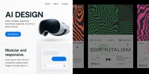
In contrast, rebellious design reminds us that creativity isn’t always neat. It’s often messy, emotional, and deeply human.
For IT brands, this creates a strategic opportunity:
Do you want to reflect tech innovation through sleek AI-influenced visuals, or stand out by showing your human edge?
There’s no wrong answer but there is a need for intentionality.
What This Means for IT Marketers
Your audience, whether MSPs, vendors, or customers, is being bombarded with messages of automation, transformation, and innovation. But they also crave connection, trust, and individuality.
When reviewing your brand’s visual identity, ask:
- Are we visually signalling that we’re tech-forward, or do we look like every other AI-powered brand?
- Does our design reflect our values and voice, or has it been diluted by trend-chasing?
- Could a more human, nostalgic, or experimental approach help us cut through the noise?
Our Take: Balance is Everything
At ResourceiT, we’re not picking sides. We believe in using AI where it adds value, to streamline, accelerate, and enhance. But creativity, storytelling, and brand strategy? That still needs a human at the wheel.
AI is a tool. Brand is a feeling.
The AI revolution is here. You can ride the wave, swim against it, or find your rhythm somewhere in the middle. What matters is that your brand chooses intentionally.
Need help making that choice clearer or more compelling for your audience?
Let’s talk about how design and strategy can work with AI, not be defined by it.